Resmed
Resmed is the world leader in sleep health, creating life-changing technologies that people love.
The Ask
The project focused on two key objectives: (1) enhancing navigation for the U.S. site to improve usability and accessibility, and (2) translating the new brand identity into a cohesive and engaging web experience.
The Result
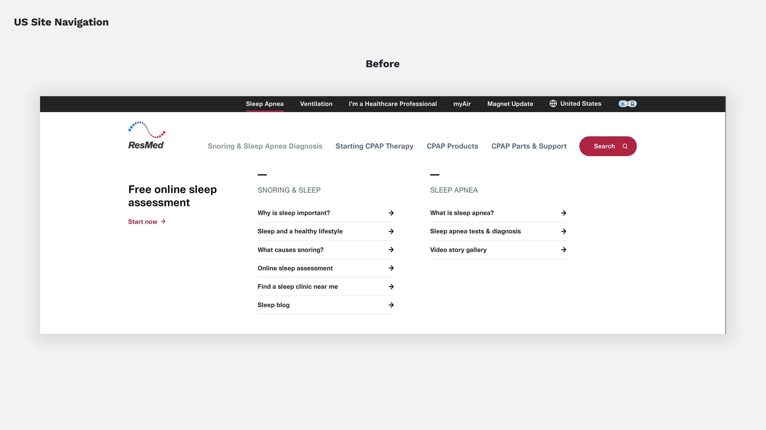
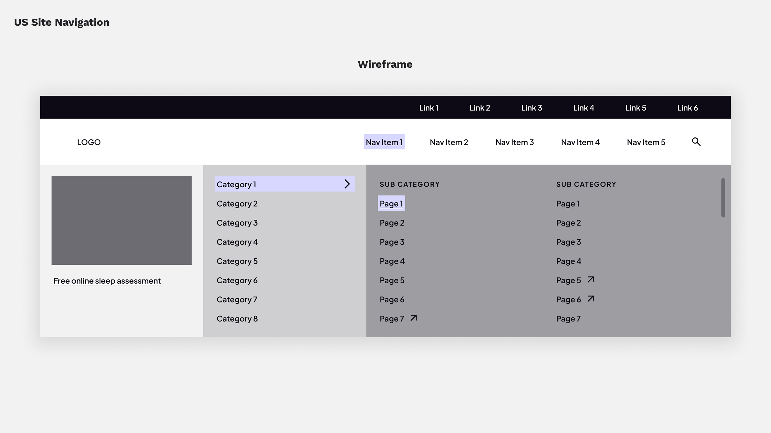
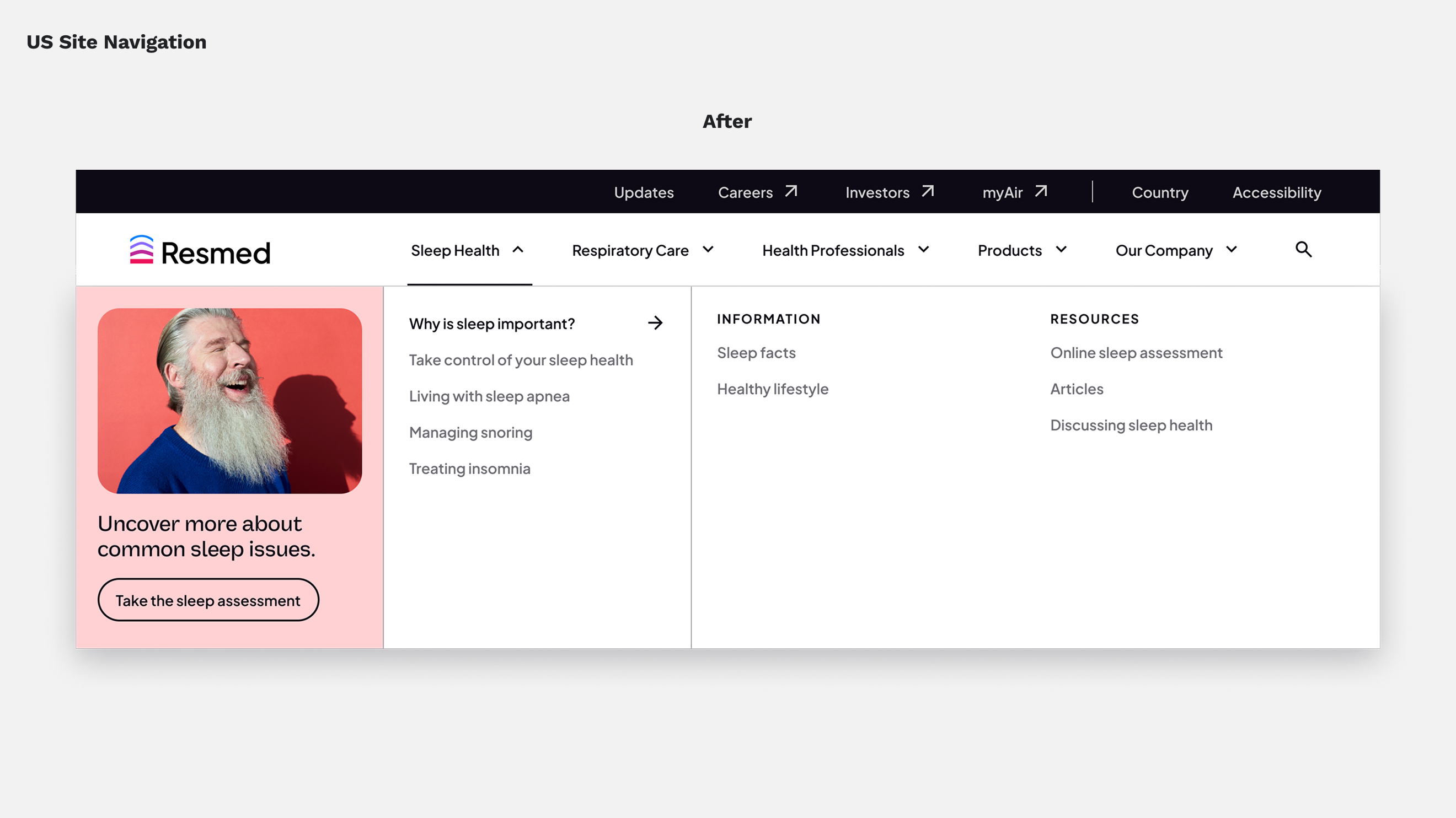
The first step was updating the utility navigation, global navigation, and footer, consolidating multiple micro-sites into a unified platform. Using information architecture principles, we redesigned the navigation to be scalable, allowing flexible expansion of categories. High-fidelity prototyping helped refine the experience before implementation.
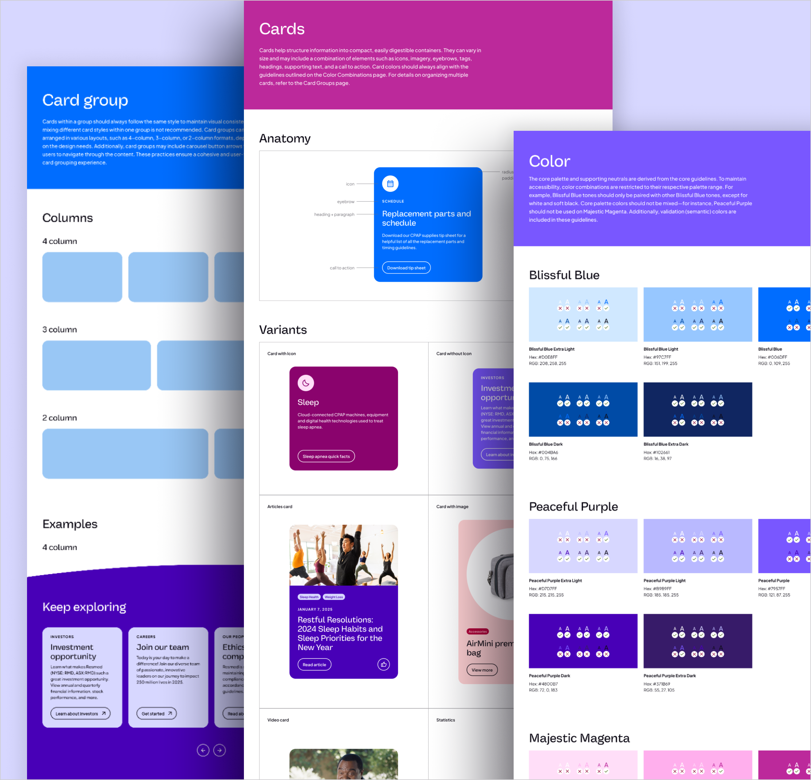
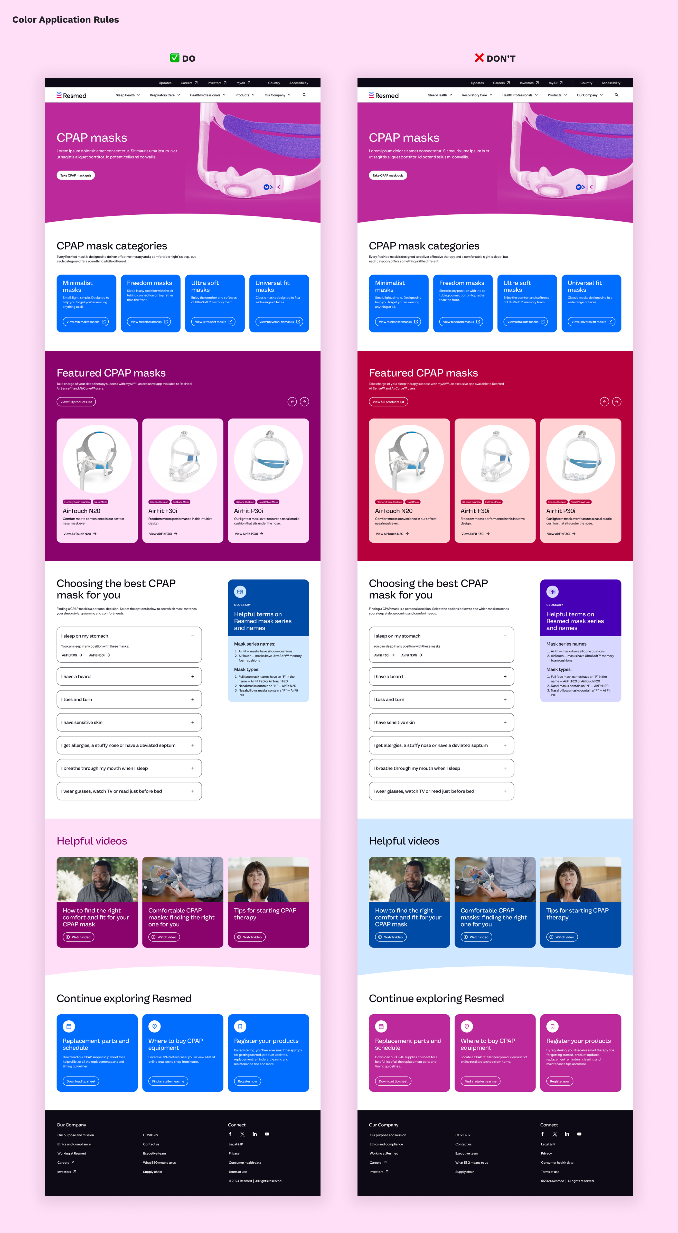
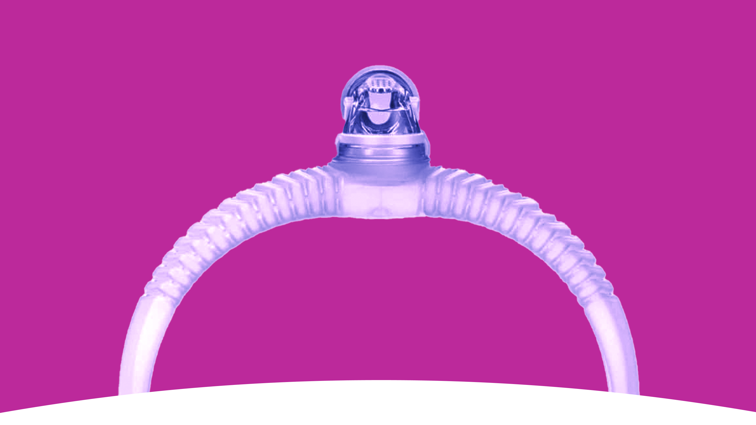
Bringing the new brand identity to the web required iterative exploration. The updated brand palette introduced complex rules, leading us to limit color combinations per page for consistency. This approach not only enhanced cohesion across the site but also influenced broader brand activations. Similarly, we refined the use of the rise arch motif, strategically placing it at the beginning and end of pages to reinforce brand recognition without overuse.
To ensure long-term consistency, we developed a comprehensive web brand toolkit. This resource standardized brand rules, enabling seamless implementation across all digital touchpoints, including international sites.
Role
Freelance
Project Deliverables
Toolkit, Brand Implementation, System Application